BioAsia
The Biggest event in ASIA Continent, that brings drastic changes in Bio-tech Sector,
The Annual event with a different theme & concept every year,
The Biggest Platform for Companies, Research Institutions, Analysts, Regulators, Investors, Service Providers and Policy makers etc.,
BIO-ASIA with More than 50 Countries Participation is
TheINTERNATIONALConference that collaborates USAand European‘Drug development Companies with Asian Bio-tech and Pharma Companies.
We took the initial step of approaching BIO-ASIA in 2014. The only strength we have in stepping forward is our Confidence of over a decade experience.
The First meeting was an opportunity for Mutual understanding that later on changed to a Healthy relationship.
As Bio-Asia is an Annual event with different theme and concept, we have to develop New & Fresh Ideas for the Concept & Event promotion through Theme based Logo designs, Back Ground Visual Presentation for the Dias and every other Promotional formats to the max.
BioAsia 2015 – The event is projected on the theme of “NEW ERA OF LIFESCIENCES – Opportunities in transformation”. The Logo we presented was “The Perfect Blend of DNA with Colorful Butterfly Wings indicating New hopes, New Era and the Flying aspect representing Growth in the sector”.
BioAsia 2016 – Planned on the Concept of “LEVERAGING INDIA TO SUCCEED GLOBALLY – Connecting Dots”, was a special event that involved Indian Govt. Theme of MAKE IN INDIA. The Logo was also unique with “Hexagon shape of World with Connecting Dots having India map involved and BioAsia2016 Typo centered below”.
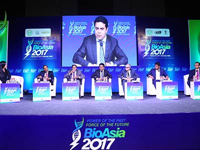
BioAsia 2017, mainly concentrated on the concept of “Power of the Past, Force of the Future”. This concept was powered by our Logo designed with “Power Transforming itself and Taking shape of DNA, projecting high indicating it’s Progress into the Next level of the Future”.
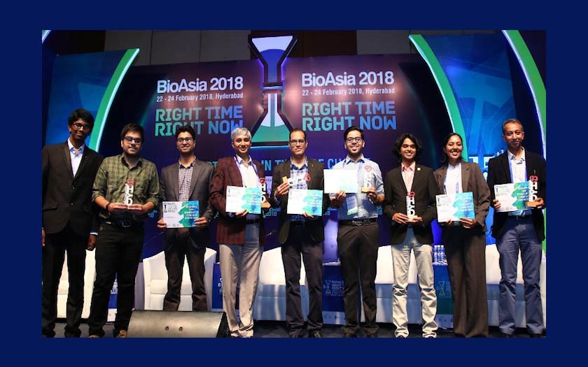
BioAsia2018, is significantly Promoted on the focused theme of “RIGHT TIME, RIGHT NOW – Opportunities in times of change”. The Logo is designed with 2 Lab beakers placed one above the other resembling a look of Hourglass with sand pouring down. It reflects the main concept that time changes forever and opportunities in times of change should be caught at the Right TIME which is Right NOW.
These Logos and Designs developed are carry forwarded in each and every promotional activities such as Announcement, Launching, e-mailers, Stationary, PPT, Sponsors Brochures, Web Theme, Flyers and all Promotional Mail Sheets throughout that year.
Besides these, They have an important place on Onside event branding from Set design, Exhibition Hall Hanging Banners, Conference & Media Backdrops, ID cards, Notepad, Standees, Pillar Branding, Event Information Books, Interior and Exterior Branding of On site event, Roadside Lollipops, Bus Shelters, Bus Branding, Foot over Bridge Signage’s, Hoardings and outdoor media.