ABC – Case Study
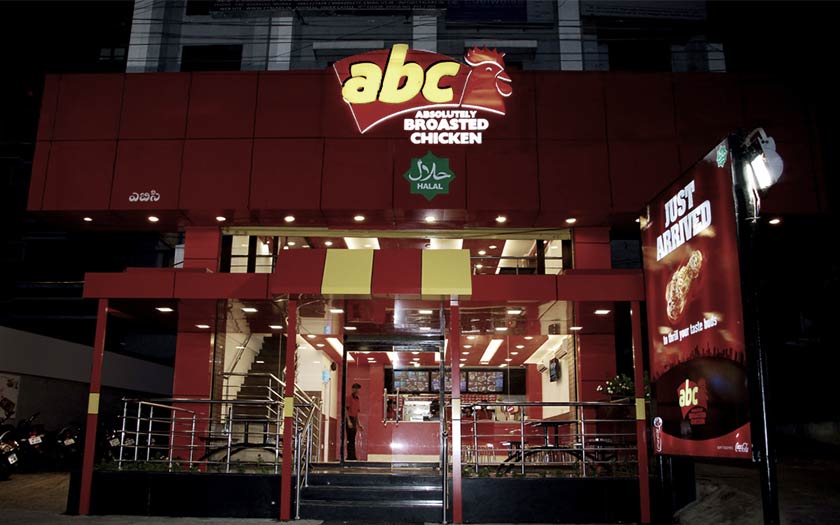
The First step is Thought. The Second is Planning. When we met the owners of ABC, they are at the step of Planning Interior Setup. Though the Physical setup is at the initial stage, they have complete idea about serving Broasted Chicken and other Chicken Delicacies with extra-ordinary taste compared to the present in the market.
They insisted the same on their Promotional activities and asked us to Develop Logo Concepts as the First step of our meeting.
As we already got the preliminary information that the Chicken items from ABC will resemble KFC, Mc Donalds, Chicken king, Venkob chicken and Subway – we started collecting the different marketing & product design material such as Information Leaflets, Bucket & Cup Designs etc. By visiting each store.
Then we moved on to development of Logo Designs and the one at present is accepted. The LOGO Concept is developed on the theme of Tradition & Trend with Yellow and Red Colors.
After the Finalization of the logo, we proposed to promote ABC differently with “TEASING Signage – who is coming”. It is a LAUNCHING TEASER SIGNAGE and this developed enthusiasm in the people and made them look forward every day for 2 months to know that finally “It is ABC!”.
After 2 Months, exactly on the Launching Day, the 2nd Signage was displayed showing a CHICKEN LEG PIECE FALLING FROM SKY, just like a space material shredding Fire with intense HEAT & FRESHNESS. This gave an impression to the people that the one coming there was “ABC” launched to serve “BROASTED CHICKEN”.
The Event was a Big Hit as we expected and now we continued with our PACKAGING Designs that were started earlier. Different Designs involved Chicken Box and Bucket, Glass for Chicken Pops, Soft Drink Glasses, Pouch for French-Fries and All the internal supplying packaging with different styles maintaining the brand’s theme simultaneously, Promoting it with a visually attracting colourful themes and concepts.
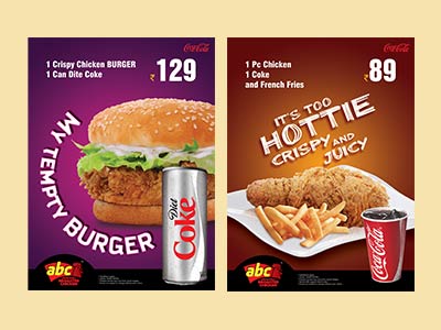
The regular photo-shoot with illustrations of Chicken pic, French fries, Burgers, Ice creams, Milkshakes, Dips and etc. Blended well.
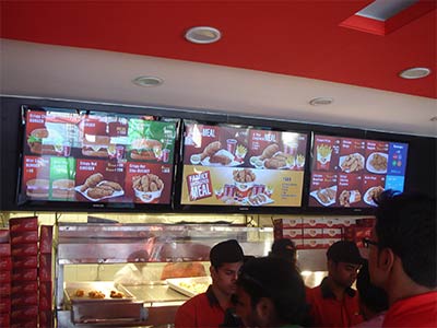
The Digital Display Menus On-store, Flyers, Signage’s in Parking, Store outside, Interior Wall Conceptual Designs, Paper Advertisements, Napkins, Dress code and Stationary have clicked to the most.
